
Advanced Visualization in Python – A Beginner’s Guide
Welcome back to the latest edition of Data Science Demystified! In this edition, we will explore Advanced Data Visualization Techniques in Python. Data visualization is not just about creating colorful charts; it’s about presenting information from large sets of data in a way that is easily understandable and engaging.
In this edition, we will delve into advanced visualization techniques using Python’s most popular visualization libraries. This beginner’s guide is for you if you’re ready to move beyond basic charts and plots and want to explore interactive, informative, and visually engaging ways to represent your data!
Table of Contents
How to Enhance Your Data Analysis with Advanced Visualization in Python
Data visualization plays a crucial role in understanding complex data, allowing data scientists, business analysts, and decision-makers to extract actionable insights. Python’s advanced visualization libraries, including Matplotlib, Seaborn, and Plotly, enable us to move beyond basic graphs and generate advanced visualizations that emphasize trends, patterns, and anomalies.
Why Advanced Data Visualization?
While basic plots like bar charts, histograms, and line graphs are useful, they may not fully capture the depth of your data, especially when dealing with multi-dimensional datasets or large volumes of information. Advanced data visualization techniques allow us to:
- Identify Relationships: Correlation plots and pair grids make it easy to see how variables interact.
- Show Trends Over Time: Heatmaps and time series charts highlight trends over time.
- Handle Multidimensional Data: Tools like 3D plots or facet grids allow you to visualize multiple variables at once.
- Improve Interpretability: Visual representations such as violin plots or boxplots make statistical summaries more accessible.
Essential Python Libraries for Data Visualization
Let’s start by reviewing some essential Python libraries used for advanced data visualization.
- Matplotlib: One of the most foundational libraries for creating static, animated, and interactive visualizations in Python. Matplotlib’s versatility allows for highly customizable visualizations.
- Seaborn: Built on top of Matplotlib, Seaborn simplifies the creation of aesthetically pleasing and informative statistical graphics.
- Plotly: An interactive, web-based library used to create interactive and rich visualizations.
- Altair: A declarative statistical visualization library that makes it easy to create complex visualizations.
Implementing Advanced Data Visualization in Python
Now that we’ve covered why advanced data visualization is essential, let’s dive into some examples of how to implement these techniques in Python.
Correlation Heatmap
It is a graphical representation of the correlation between different variables in a dataset. It is an excellent tool for visualizing relationships between multiple variables. It shows the correlation between each pair of variables in a dataset, making it easy to spot high or low correlations.
It uses colors to show the strength and direction of the correlation, making it easier to identify patterns and relationships. Correlation heat maps are commonly used in data analysis and machine learning to visualize the relationships between features and guide feature selection.
Use Cases of Correlation Heat Maps
- Feature Selection: By visualizing which features are highly correlated, you can identify redundant features and reduce multicollinearity in your dataset.
- Data Exploration: Heat maps give a quick overview of relationships between variables, which is useful during the exploratory data analysis (EDA) phase of a project.
- Model Interpretation: Correlation heat maps can help understand how different features might impact the target variable or each other.
Here’s how you can create a correlation heatmap using Seaborn:
#Import libraries
import pandas as pd
import seaborn as sns
import plotly as plt

# Load Iris dataset from seaborn datasets
df = sns.load_dataset('iris')

# correlation matrix setup
corr_matrix = df.corr(numeric_only=True)

# Create a heatmap using seaborn
plt.figure(figsize=(8,6))
sns.heatmap(corr_matrix, annot=True, cmap='coolwarm', vmin=-1, vmax=1)
plt.title("Correlation Heatmap")
plt.show()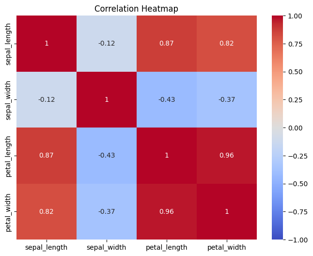
Heatmap Interpretation
- Diagonal Elements: The diagonal will always show a perfect correlation (1.0), as each variable is perfectly correlated with itself.
- Color Gradient: The color intensity indicates the strength of the correlation. Darker colors usually represent higher correlations (positive or negative), while lighter colors indicate weaker or no correlation.
- Clusters: Variables that are highly correlated will often appear as blocks of similar colors, which can help you spot feature groups with high mutual influence.
Pair Plots
A pair plot is a data visualization technique that displays the relationships between multiple variables in a dataset. It’s particularly useful for exploring the relationships between numerical features, helping to identify patterns, trends, and potential correlations. Seaborn makes it easy to create pair plots that show both scatter plots and histograms on the same grid.
Pair plots are often used in Exploratory Data Analysis (EDA) to give an overview of how variables interact with each other. This technique is particularly useful when you want to explore relationships between multiple variables at once.
Use Cases of Pair Plots
- Exploratory Data Analysis (EDA): Pair plots are excellent for quickly visualizing relationships and patterns in the data before building models.
- Feature Selection: By examining the scatter plots and correlations, you can decide which features to keep or drop from your model. Strong linear or non-linear relationships can guide feature engineering.
- Class Separation: The hue parameter allows you to explore how well different classes (e.g., species) are separated by the features, which is useful for classification problems.
# import libraries
import seaborn as sns
import matplotlib.pyplot as plt

# Load Iris dataset
df = sns.load_dataset('iris')

# Create the pair plot for Iris data
sns.pairplot(df, hue='species', diag_kind='kde')

# display the pair-plot
plt.show()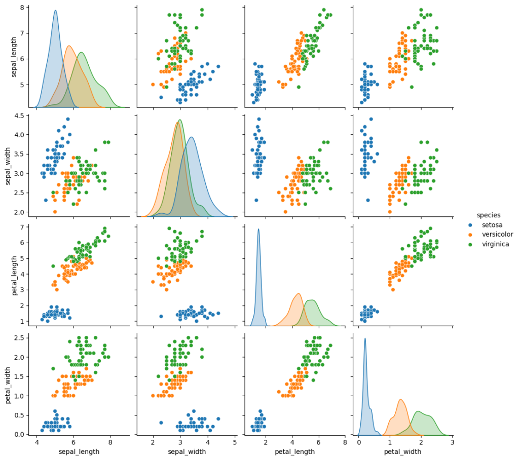
Pair Plot Interpretation
- Scatter plots: Each pair of features is represented in a scatter plot to display their relationship. If two features are strongly correlated, the points will form a linear pattern.
- Diagonal plots: The diagonal plots show the distribution of each individual feature. If diag_kind=’kde’ is used, a smooth KDE plot is shown, while histograms show the raw distribution of the values.
- Color-coding by category: When the hue parameter is used, it color-codes the data points based on a categorical variable, making it easier to see how different categories interact with the numerical features.
Violin Plots
A violin plot is a type of data visualization that combines elements of a box plot and a KDE (Kernel Density Estimate) plot. It is used to display the distribution of a numerical variable for one or more categories and shows the density of the data across different values. A violin plot is especially useful for comparing the distributions of several groups at once, providing a more comprehensive representation of the data distribution than standard box plots.
Advantages of Violin Plots
- Detailed Distribution: Unlike box plots, which only provide a summary (median, quartiles), violin plots show the entire distribution of the data, making it easier to identify skewness, multimodal distributions, and outliers.
- Compare Multiple Distributions: When dealing with multiple categories or groups, a violin plot allows for easy comparison of their distributions.
- Visual Appeal: Violin plots offer a visually appealing and informative summary of the data’s distribution.
Disadvantages of Violin Plots
- Interpretation: They may be more challenging to interpret for individuals unfamiliar with KDEs or density plots.
- Too Much Detail: Sometimes violin plots can include more information than necessary, especially if you only need a quick summary (as in a box plot).
import seaborn as sns
import matplotlib.pyplot as plt

# Load the Iris dataset
df = sns.load_dataset('iris')

# Create a violin plot
sns.violinplot(x='species', y='sepal_length', data=df)

# Show the plot
plt.show()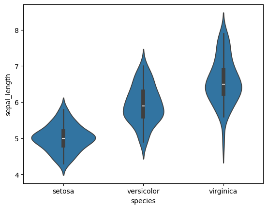
3D Plots
3D plots are visualizations that help you explore the relationships between three numerical variables. These plots provide depth to your analysis by showing how the values of one variable change along with two others. They are particularly useful in fields like machine learning, physics, engineering, and any context where three-dimensional relationships are relevant.
In Python, you can create 3D plots using the Matplotlib library, which offers tools for creating and customizing a wide range of 2D and 3D visualizations. For datasets with more than two dimensions, 3D plotting allows you to visualize multiple variables at once. Matplotlib’s mplot3d toolkit makes it simple to create 3D visualizations.
When to Use 3D Plots
- Understanding complex relationships: A 3D plot provides insights that would be hard to capture in 2D when visualizing how three variables interact.
- Trajectory analysis: For modeling movement through space, such as in physics simulations, a 3D line plot can help track how an object moves over time.
- Surface fitting: In regression analysis or mathematical modeling, 3D surface plots help visualize how the output changes based on two input variables.
#import libraries
import matplotlib.pyplot as plt
from mpl_toolkits.mplot3d import Axes3D
import numpy as np

# random data for 3D scatter plot
x = np.random.rand(500)
y = np.random.rand(500)
z = np.random.rand(500)

# Create a 3D plot
fig = plt.figure()
ax = fig.add_subplot(111, projection='3d')

# Plot data
ax.scatter(x, y, z, c='b', marker='o')

# Add labels
ax.set_xlabel('X Label')
ax.set_ylabel('Y Label')
ax.set_zlabel('Z Label')

plt.show()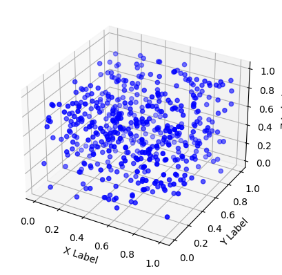
Interactive Visualizations with Plotly
Plotly is a powerful Python library for creating interactive visualizations, enabling users to zoom, pan, hover, and even export plots easily. Unlike static plots (like those generated by Matplotlib or Seaborn), Plotly visualizations are dynamic and offer a more interactive way of exploring data.
Advantages of using Plotly
- Interactive: Allows users to interact with the plots (zooming, panning, hovering).
- Web-based: Plotly creates web-based visualizations that can be embedded in web pages or Jupyter notebooks.
- Wide Range of Plot Types: Supports a variety of charts like scatter plots, line plots, bar charts, 3D plots, choropleth maps, and more.
- Customization: High level of customization for layout, colors, and interactivity.
Plotly is a powerful Python library for creating interactive visualizations. It allows users to zoom, pan, hover, and export plots easily. Unlike static plots generated by libraries such as Matplotlib or Seaborn, Plotly visualizations are dynamic and offer a more interactive way to explore data.
Advantages of using Plotly
- Interactive: Users can interact with the plots by zooming, panning, and hovering.
- Web-based: Plotly creates web-based visualizations that can be embedded in web pages or Jupyter notebooks.
- Wide Range of Plot Types: Supports a variety of charts such as scatter plots, line plots, bar charts, 3D plots, choropleth maps, and more.
- Customization: High level of customization for layout, colors, and interactivity.
For instance, creating an interactive 3D scatter plot with Plotly:
import plotly.express as px
import seaborn as sns

# Load dataset (e.g., Iris dataset)
df = sns.load_dataset('iris')

# plotting interactive visualization
fig = px.scatter_3d(df, x='sepal_length', y='sepal_width', z='petal_length', color='species')
fig.show()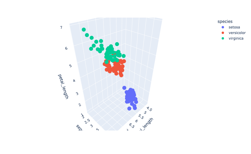
Interactive visualizations allow your audience to explore data by zooming in, hovering over points, and filtering out different parts of the chart.
Career Corner
Advanced Data Visualization Skills for Data Science Enthusiasts
Data visualization is more than just a tool for understanding data; it is a critical skill for data scientists. It enables them to effectively communicate insights to stakeholders. As businesses increasingly rely on data to make decisions, advanced data visualization skills can help you stand out in your career. Some roles where these skills are highly sought-after include:
- Data Analyst: You’ll need to turn raw data into actionable insights with impactful visuals.
- Business Intelligence Developer: Your job will involve building interactive dashboards and reports.
- Data Scientist: Communicating findings through advanced visualizations is a key component of this role.
By mastering advanced visualization techniques, you’ll be able to convey more nuanced insights and make a stronger impact in your data science career.
Tech Trends Spotlight
The Rise of Interactive Dashboards
In today’s fast-paced business environment, static reports and charts are quickly being replaced by interactive dashboards. Tools like Tableau, Power BI, and Plotly Dash are gaining prominence as they allow users to explore data in real-time. Learning how to build interactive dashboards is a valuable addition to any data scientist’s skill set.
Interactive dashboards are becoming essential for:
- Real-time Decision Making: Users can filter, sort, and drill down into the data as they make decisions.
- Customization: Dashboards can be tailored to specific user roles or business needs.
- Accessibility: Non-technical stakeholders can interact with and explore data without needing to write code.
Data visualization is more than just a tool for understanding data; it is a critical skill for data scientists. This enables them to effectively communicate insights to stakeholders. As businesses increasingly rely on data to make decisions, advanced data visualization skills can help you stand out in your career. Some roles where these skills are highly sought-after include:
- Data Analyst: You’ll need to turn raw data into actionable insights with impactful visuals.
- Business Intelligence Developer: Your job will involve building interactive dashboards and reports.
- Data Scientist: Communicating findings through advanced visualizations is a key component of this role.
By mastering advanced visualization techniques, you’ll be able to convey more nuanced insights and make a stronger impact in your data science career.
Plotly is a highly flexible and interactive library for data visualization in Python. Whether you need to create basic scatter plots or complex 3D visualizations, Plotly provides tools for all levels of complexity. With its ability to create interactive, web-based plots, it’s particularly well-suited for exploratory data analysis and reporting. For more complex use cases, you can integrate Plotly with Dash to build full-fledged data applications.
Tools and Resources Recommendations
Here are some of the best resources for learning and practicing advanced data visualization techniques in Python:
- Plotly GitHub Repository – Plotly’s official Python repository offers many examples and advanced visualization techniques.
- Python Graph Gallery – A comprehensive resource showcasing various types of visualizations using Python.
Call to Action
It’s time to enhance your visualization skills! Choose a dataset that interests you, and experiment with different types of visualizations, from correlation heatmaps to interactive 3D plots. Share your visualizations with the Data Science Demystified Network, and receive feedback from peers on how to further refine your work.
Looking for more? Start building your portfolio of advanced data visualizations by contributing to open-source projects or creating visualizations for your blog or GitHub profile.
Closing Thoughts
Advanced data visualization is not just about making your plots look better—it’s about making your data more understandable, actionable, and engaging. By leveraging advanced techniques in Python, you can turn complex datasets into compelling visual stories.
As you continue to explore these techniques, remember that the key to great visualization lies in the balance between esthetics and insights. The more you practice, the more proficient you will become at creating visualizations that not only inform but also inspire.
Until next time, keep exploring and keep learning!
#DataVisualization #Python #Seaborn #Matplotlib #Plotly #AdvancedVisualization #DataScience #MachineLearning #AI

Please let me know if you’re looking for a article writer for your blog. You have some really good posts and I believe I would be a good asset. If you ever want to take some of the load off, I’d love to write some articles for your blog in exchange for a link back to mine. Please send me an e-mail if interested. Regards!